⸻ visual identity
DTSLog Port Operations
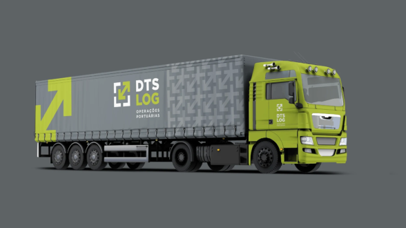
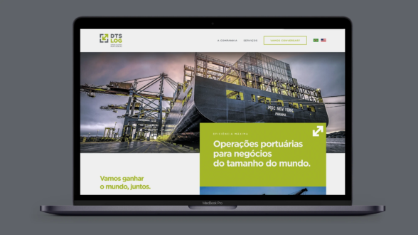
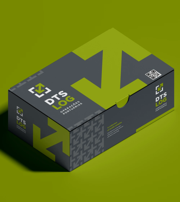
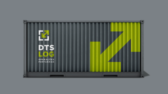
The challenge for a newcomer to the extremely competitive market of port operations was great. DTSLog’s need was to immediately present itself as a new and advantageous option and this required a robust, contemporary Visual Identity, capable of saying what it came to its various stakeholders. The strategy adopted included the vibrant shade of green in contrast to the seriousness of gray. The arrow pointing outward and inward simultaneously signals a customer-oriented company, but also one that is permanently committed to the constant internal improvement of its processes and services.


